A Weekend With Apple Watch
It's totally and completely unnecessary.
What I mean by that is that everything Apple Watch does can already be achieved on your iPhone. You can already read your notifications, message people, track your fitness, tell the time and so-on. The Watch lets you do some of these things quicker. At least that's the idea.
It seems that for once I've been lucky. I ordered my watch on the 28th April and it showed up Friday. Three days from walking into the Apple Store to the thing showing up and my office. Considering I was given a dispatch time of June, that's probably some of the worst estimating in history.
And yeah, I ordered it in store. I was pretty sure I didn't want one after reading The Verge's review but then I tried it on and Apple's devilishly clever marketing sucked me in like a fucking Dyson.
Apparently ordering in store gives you a better chance it'll be delivered sooner. At least according to the lovely lady that served us.
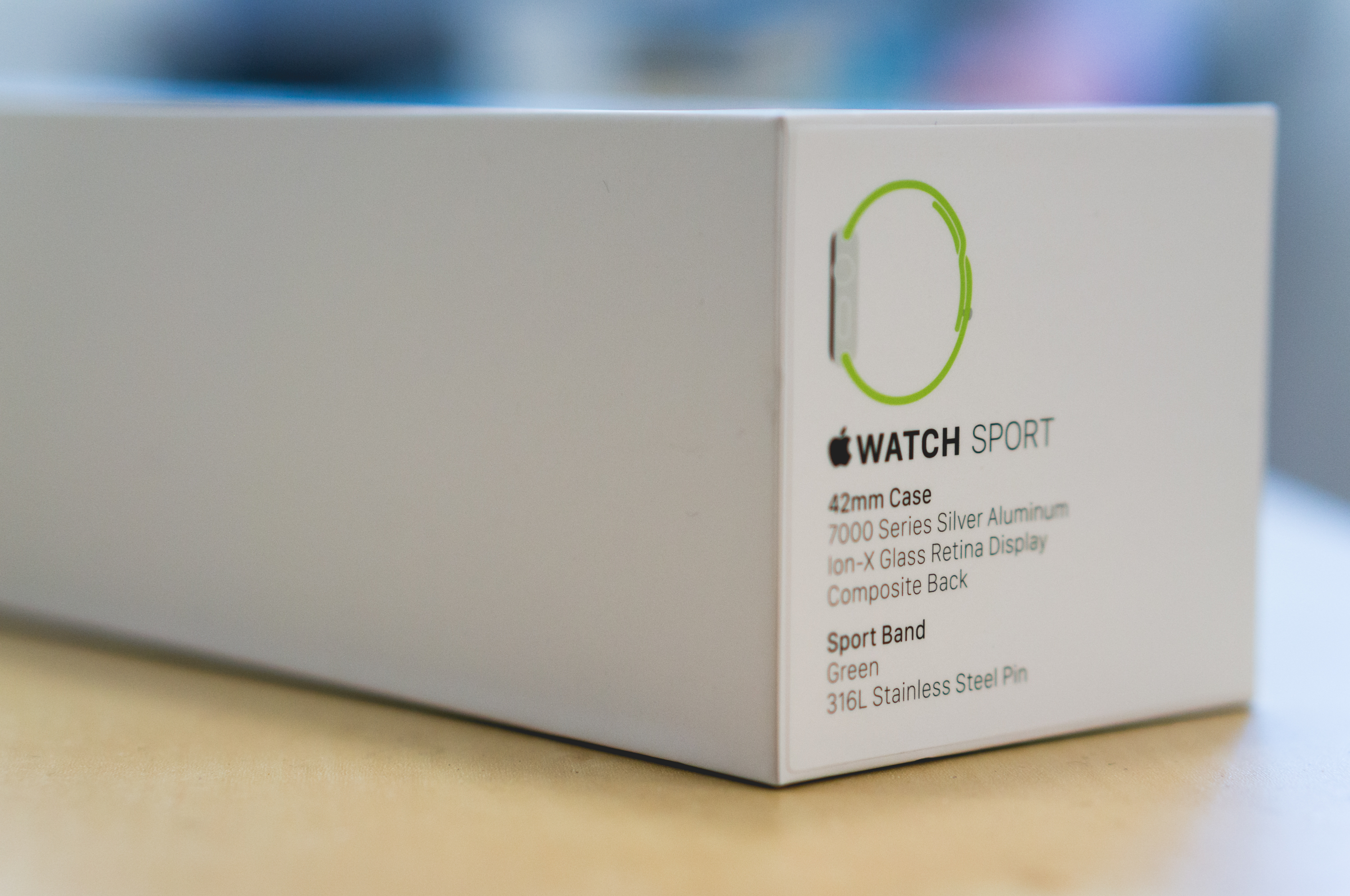
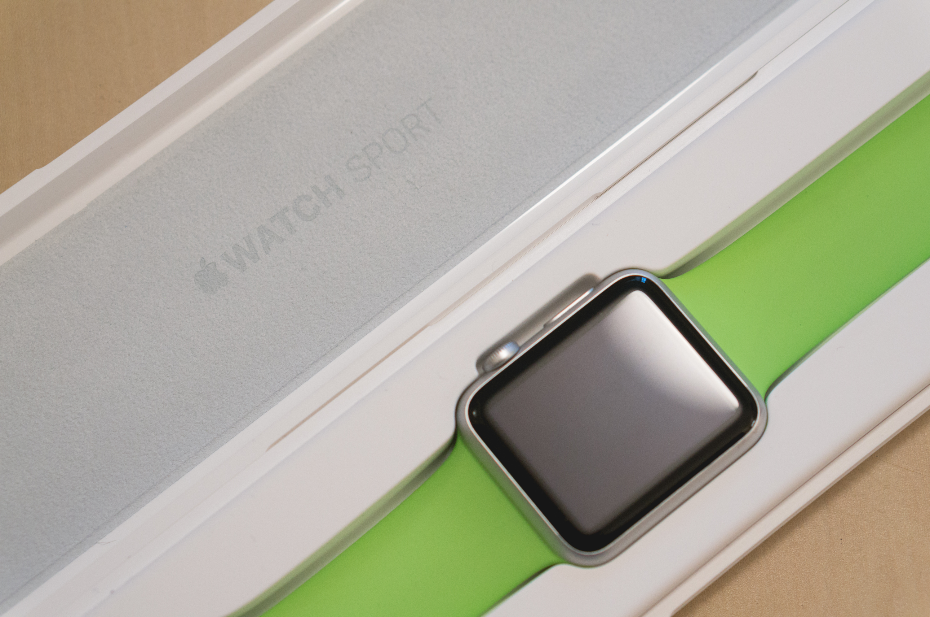
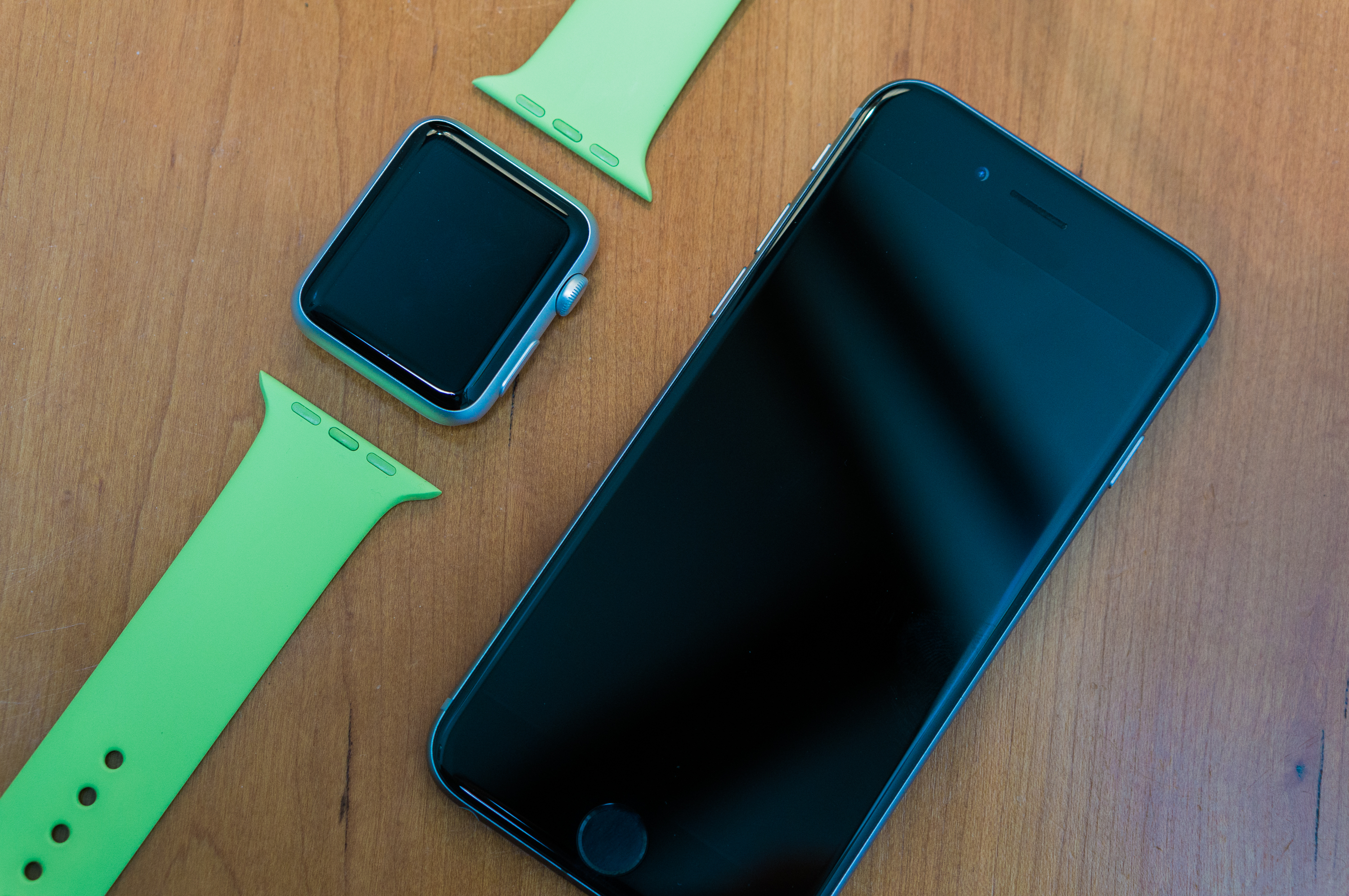
I snagged a silver Sport with a green strap and got the same with a blue band for Declan. His still has an estimated dispatch date of June. He's not happy with me but I guess green just isn't as popular 😄
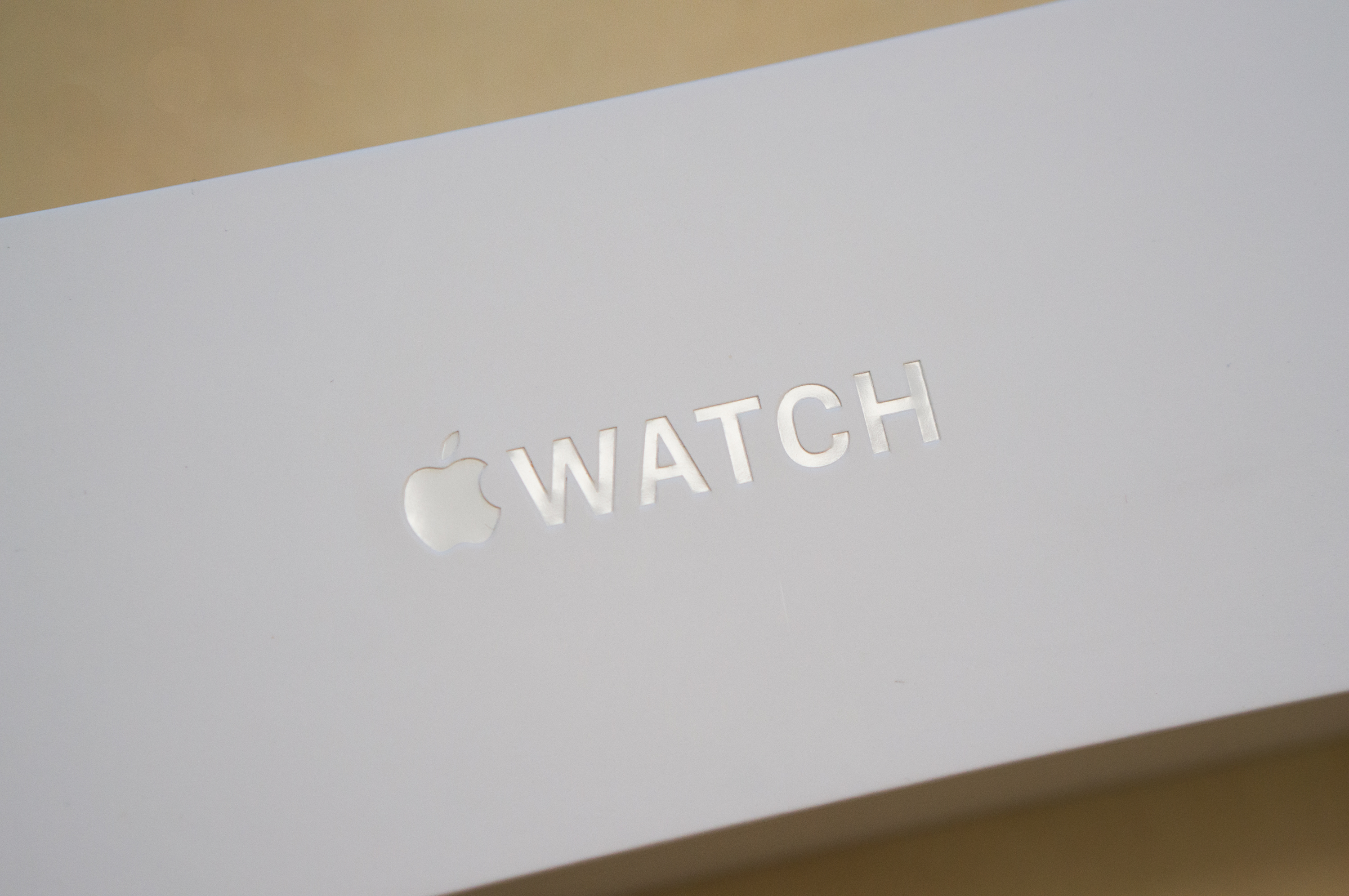
Packaging
The packaging is super minimal and clearly follows the style brought in with the iPhone 6.
The plastic case it comes with seems a little redundant. Seeing as you have to charge this thing every night, who actually is gonna put it in here for safe keeping? Still, it makes the whole opening of the thing pretty nice.
Below that is the usual pictogram instructions that nobody even looks at, but possibly my favourite thing inside of this magical white box is the awesome new UK plug. Seriously, how fucking cool is this thing?!?!
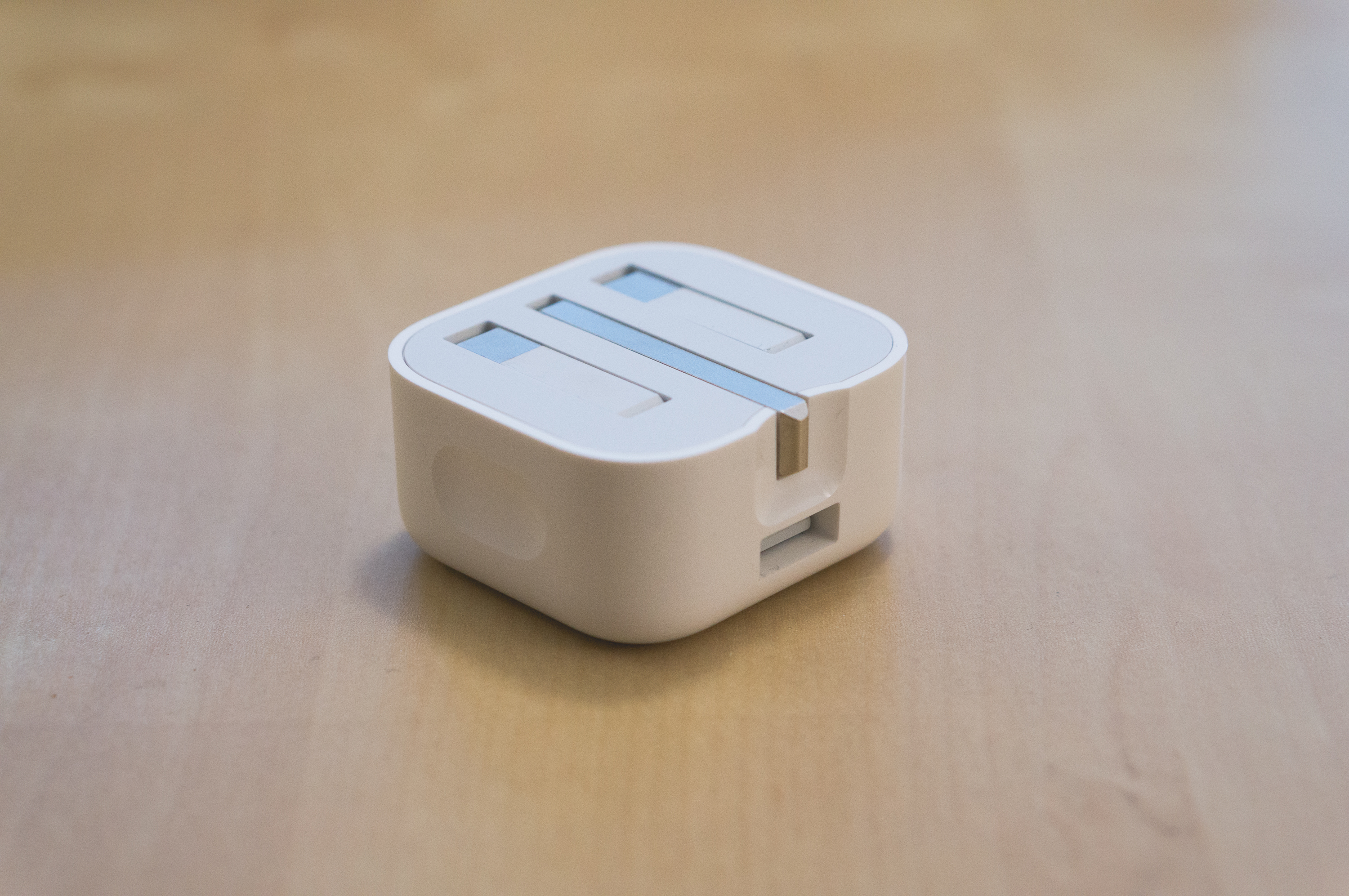
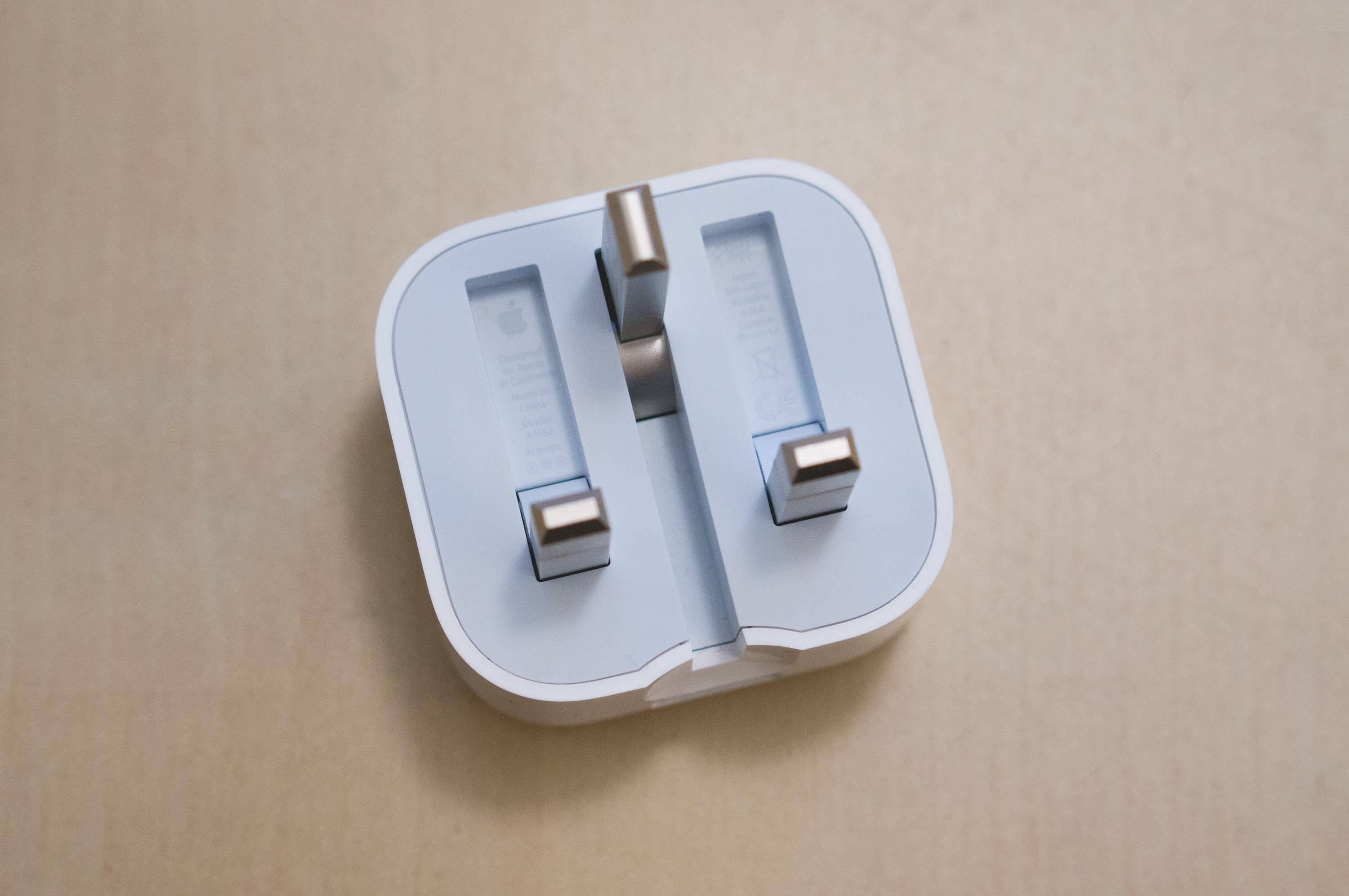
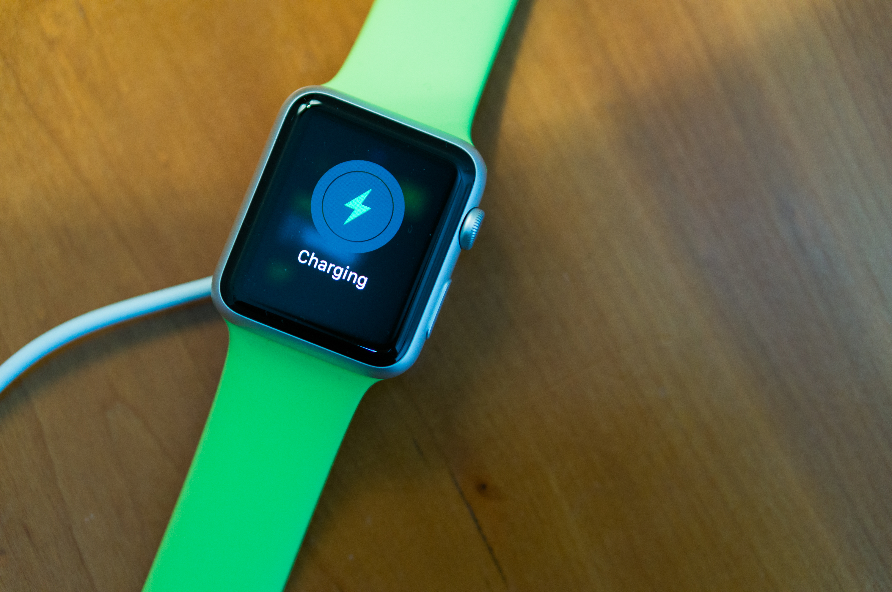
Oh and the charger it comes with is awesome. Magnets are just the best. And I've found the little power circle has enough weight to it that it just stays there. No dock needed.
The Hardware
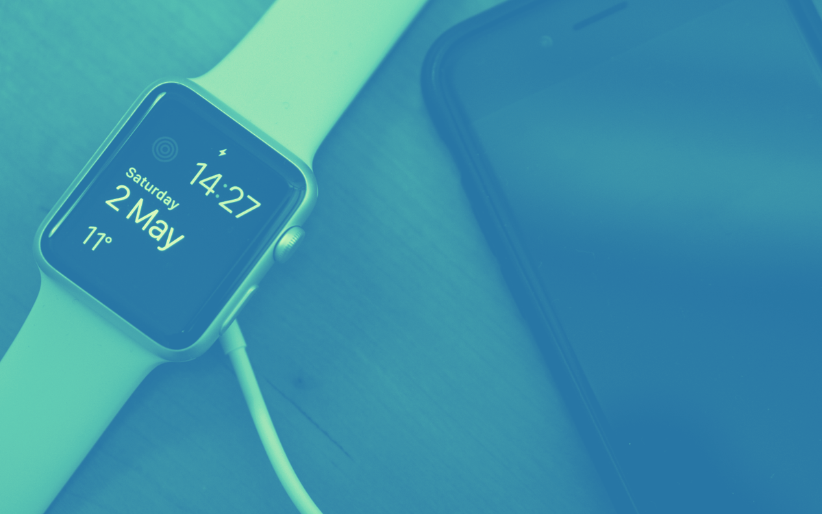
I actually can't believe how small this thing is. Even the 42mm one is tiny and I can't help but think something a little bit bigger would be good.
I've only got one strap at the moment but that's definitely gonna change. These rubb— sorry, fluoroelastomer straps aren't the nicest. They're soft to the touch but I felt my wrist getting a little clammy after wearing it a few hours.
The way you change them is so clever. Two little buttons and slide it right out. I'll probably get a Milanese Loop or a Leather Loop which will hopefully be more breathable.
On the back is the heart rate monitor. It's pretty nifty to be able to check that in the glances every now and again but it also detects when the watch is off your wrist and automatically locks it.
I also can't get over how awesome that screen is. Unless I was in bright sunlight I couldn't even see where the screen ended and the glass began.
For the first couple of days I coddled this thing like a new born baby but after a couple of knocks it's pretty clear the glass on this is fairly scratch resistant. I even accidentally hit it with my keys and it's still pristine.
Setup + iPhone App(s)
Pairing it was cool. This weird glowy globe thing pops up like one of those ascended beings from Stargate. You scan it with your iPhone in that Watch app that they spammed you with in the last update. I've taken it out of my "Apple Crap" folder now though.
Sorry Stocks. You're never coming out.
The app is actually pretty crucial. You can control notifications, apps, glances etc. etc. I deleted most of the apps and turned off a boatload of notifications. Seriously Real Racing, nobody wants your shitty app on their watch.
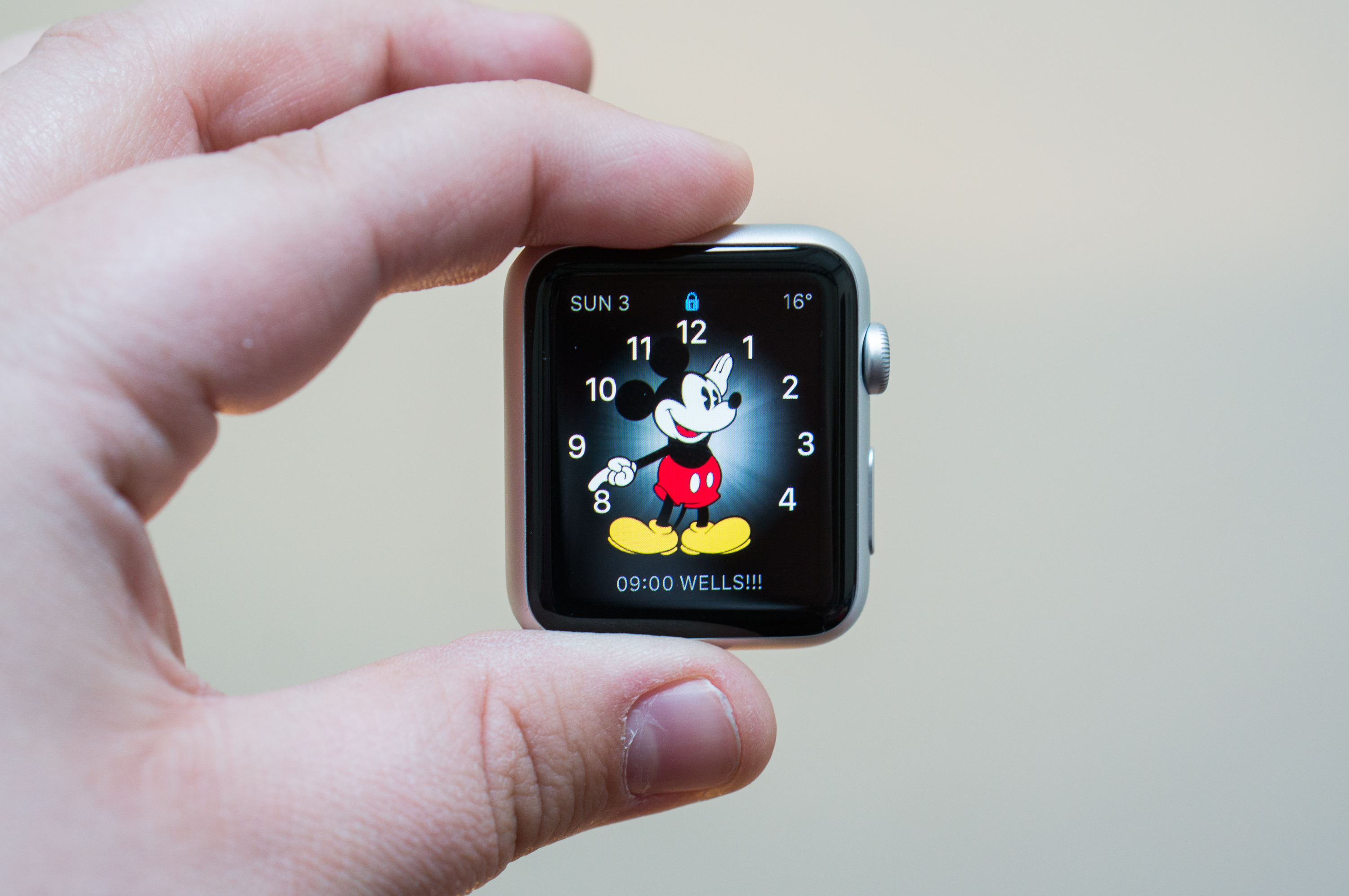
BUT you can't manage your watch faces here. All of that needs to be done on the device itself. Why can't you add new faces here and name them? For example I want two versions of the "Utility" face — my favourite — for work and home. You can do that on the watch but you can't name them and you can't sort the order of them. It seems strange considering you can do this for Glances via the app.
The level of customisation changes between the different faces and some even let you control them with the digital crown. For example, the "Astronomy" face will let you scroll through moon phases and the "Solar" face scrolls through the the sun's position throughout the day.
When you pair a watch with your iPhone you also get access to another secret app — Activity. This syncs up and shows you stats from your watch about steps, exercise and whether you've been standing enough. You'll also be able to see your trophy cabinet of e-medals here but mine's sadly pretty sparse and will probably remain that way.
Comparing it to my old Jawbone Up, the interface is much nicer and doesn't clutter it with stuff you don't care about.
What's It Actually Like?
I've had the thing for a few days now so have had a chance to try it out properly. So, is it any good?
Hide + Seek
When you starting using apps, the first thing that you'll notice is there is a lot of information hidden. When you're in an app you'll have no idea what actions — if any at all — can be performed until you force touch. It reminds me of the menu button on old Android phones that would hide everything from the user. It can be quite annoying.
You also often don't know that you can scroll. Initial screens frequently take up the whole screen and it isn't apparent that there's more information here. It took me a while to realise that I could scroll down on the Activity app for example. Wouldn't it make sense to show that little scroll bar for a split second and then fade it out?
I understand that all of this was done to de-clutter what is a very small screen (seriously, how does anyone even use the 38mm?!) but making things obvious to a user is a designer's job.
A lot of this became less of an annoyance as I used the watch over the weekend. I became used to trying to scroll and trying to Force Touch and really enjoyed the new ways of interacting.
One thing that is a nice touch, the scroll bar is green when using the digital crown but grey when scrolling via the screen.
The "Side Button"
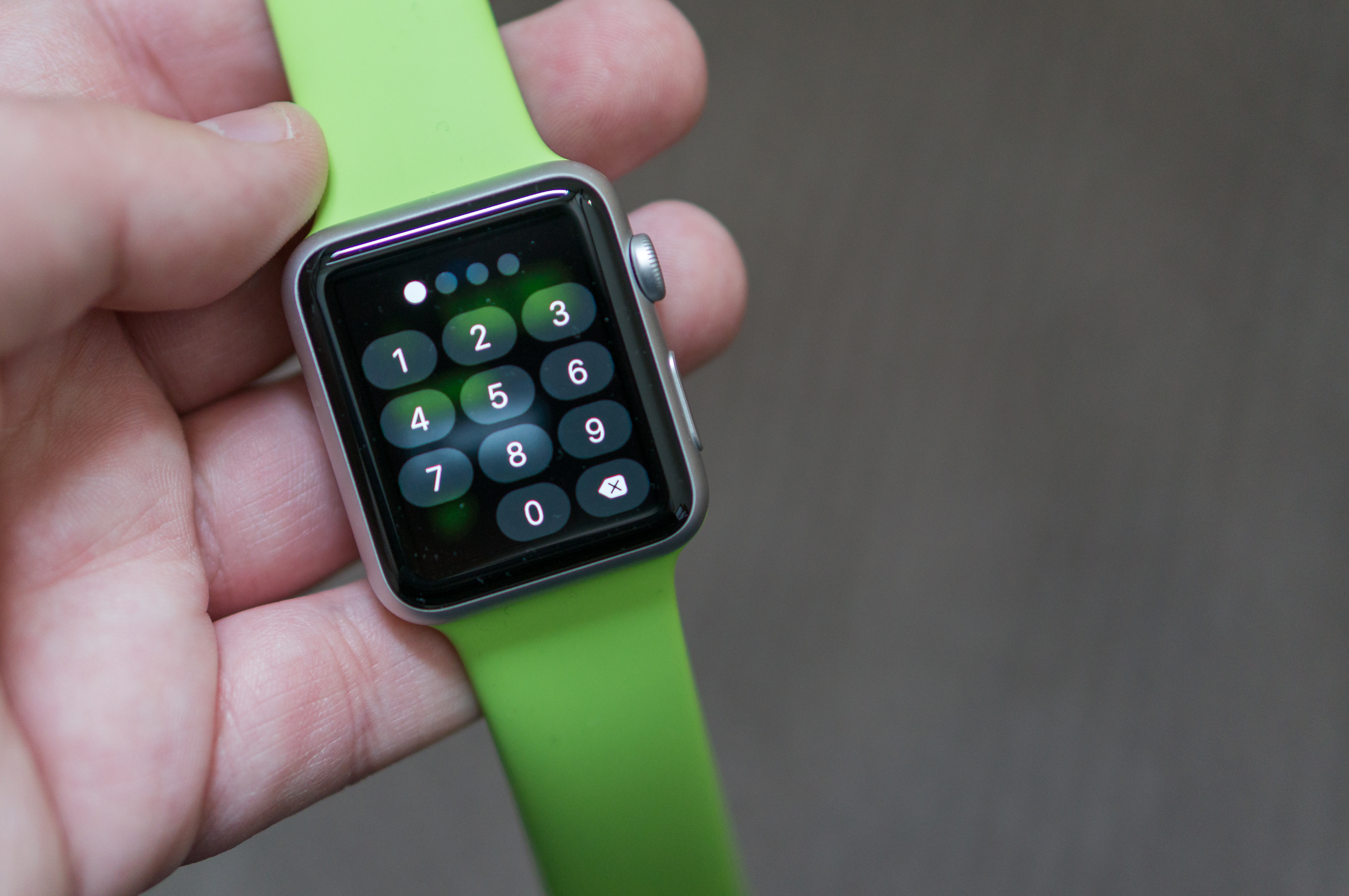
Below the Digital Crown is the button that looks just like an iPhone power button. It acts just like the iPhone power button too. If for some reason the screen doesn't come on you can click it (or the crown) and it'll light up like a Christmas tree. If you hold it you can power the watch off or put it in power reserve mode — I've not needed to yet.
Tapping it once will bring up your favourite friends and you can send them some frankly terrifying emoji. The best ones have no eyes.
If you know someone with an Apple Watch then you can use Digital Touch. They probably could have picked a less creepy name but it's pretty cool.
I've only had a chance to use it with one other person but the heartbeat thing was pretty sweet and being able to send crudely sketched dicks to Declan while he working is gonna bring me hours of joy.
One thing that's sadly lacking in the UK is Apple Pay which is accessible via a double-click of the Side Button (that's legit the official name) in the US. Why can't that action be re-assigned? Or even the single-click action? Having a quick jump to MyFitnessPal or Passbook would be much better than nothing or a wheel of friends.
Paying For Things
Yep, we don't have Apple Pay but you can still pay for one thing in the UK — Starbucks. I tried it out after work on Friday and holy fuck the future is awesome.
Once you've added your Starbucks card to Passbook and configured your favourite store, a notification will pop up when you're within range. Tap it and your card will show up. Scroll down to view the barcode which can then be scanned in store.
Glances
I really really like the concept of glances. It's what that pull-down "Today" screen on the iPhone's notification centre should be. Quick snippets of information that you can get in and get out of quickly.
I've got mine setup to show things like "Now Playing" on my iPhone and my activity. I just wish MyFitnessPal would make their app glanceable (that's totally a word).
My advice would be, don't let every single app add their glance in here. Use it for things you find yourself checking all the time or you'll be swiping left an right for hours. You can always hit that digital crown to open up things you only need every now-and-again.
Actually, thinking about it, glances are probably one of my favourite things about the watch and I've used them a lot. Skipping music while in the car is nifty (yep, it even works with Spotify), and getting BBC News headlines and keeping up with my steps is equally awesome.
Notifications
This is probably the core of the watch and it can get really annoying really quickly but it's not difficult to turn all that crap off in the Apple Watch App.
Once I'd turned it all off it was pretty awesome being tapped on the wrist when someone had messaged me or was calling. At the moment though, the problem is actioning some of those notifications. Not everything makes sense.
For example, in Tweetbot I'd like to be able to quickly dictate a reply but the options are Favourite or Retweet. Some apps like Facebook Messenger haven't been updated yet so you only have the ability to dismiss it. I'm sure that'll change with time though.
Some people have complained you can only view the notifications sheet on the watch screen but that makes sense to me. The UI would be too difficult to navigate otherwise.
Siri
I'm guessing that like most people, I used Siri to tell me lame-ass jokes and try to find places to bury dead bodies. Well, I've learned to embrace Siri with Apple Watch. It's fantastic and is frankly the easiest way to navigate the device.
I lift up my arm and say: "Hey Siri, open MyFitnessPal" and it knows exactly what to do. Oh, it can do other things too but you already know the score with that.
The only annoying thing is that anything that requires you to open the browser on your phone automatically takes you to fucking Bing.
Apps
At the moment there are very few apps that are actually worth using. There's a lot of shit on the App Store and there's a lot of duplication. How many fitness apps do there really need to be?
Here are some of the ones I found useful — included or third party.
Remote
We have a couple of Apple TVs in the house and regularly lose those useless aluminium remotes. I always used the iPhone app to control it and having it on your wrist is somehow even cooler.
MyFitnessPal
I'm currently losing weight and using MyFitnessPal to track my calories. Being able to quickly see my current calorie consumption is awesome. I just wish it was visible in a glance instead.
BBC News
Flicking through headlines is nice but getting breaking news alerts and seeing what's going on in glances is even better.
Activity
This is probably my favourite included app and it's a massive upgrade from my Jawbone Up. The watch monitors your heart rate every 10 minutes and seems to use this to measure if you're exercising or not. It can work out how many calories you've burnt based on the number of steps you've made and the weight and height you've fed the app. If you want, it'll also tell you to stand up every hour too.
Dark Sky
I've been using Dark Sky on my iPhone for a while but it's even better on the watch. You can quickly see the forecast for the next hour in your glances or click through to get more information.
Shazam
I'm not 100% sold on Shazam. It's actually pretty slow and even uses the microphone from your phone to listen so it seems a little redundant. Still, I did find myself using it so…
Conclusion
Sure, the Apple Watch is just an accessory. It adds little additional functionality other than the fitness bits and pieces. Everything it does at the moment duplicates iPhone functionality but that doesn't mean it isn't inherently cool.
Perhaps the most bizarre moment this weekend was when our waiter asked to try it on. The guy even wanted a photo with it on which was slightly strange. All I wanted was our fucking food to come out.
Still, I think it shows the popularity of the watch. At the very least it seems to be something people want to own, whether than can justify the cost for what is essentially just a gadget is another matter.
It's not perfect. It could be faster and there are some quirks with the software that I'm sure will be worked out but it's a gadget and I like gadgets.