Removing the White Bars in Safari on iPhone X

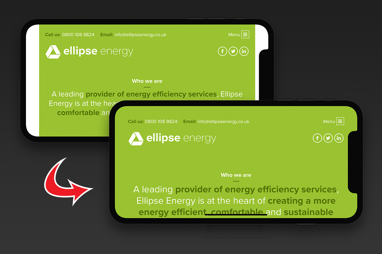
The new iPhone X features a beautiful edge-to-edge display. Well, almost. There is the small issue of a notch at the top of the browser which doesn't cause an issue when viewing websites in portrait but by default does cause some issues in landscape.
To accommodate the notch iOS 11 constrains websites within a "safe area" on the screen. On most websites this results in letterboxing on the left and the right.
Thankfully there are two simple fixes that can be made to solve this letterboxing.
background-color
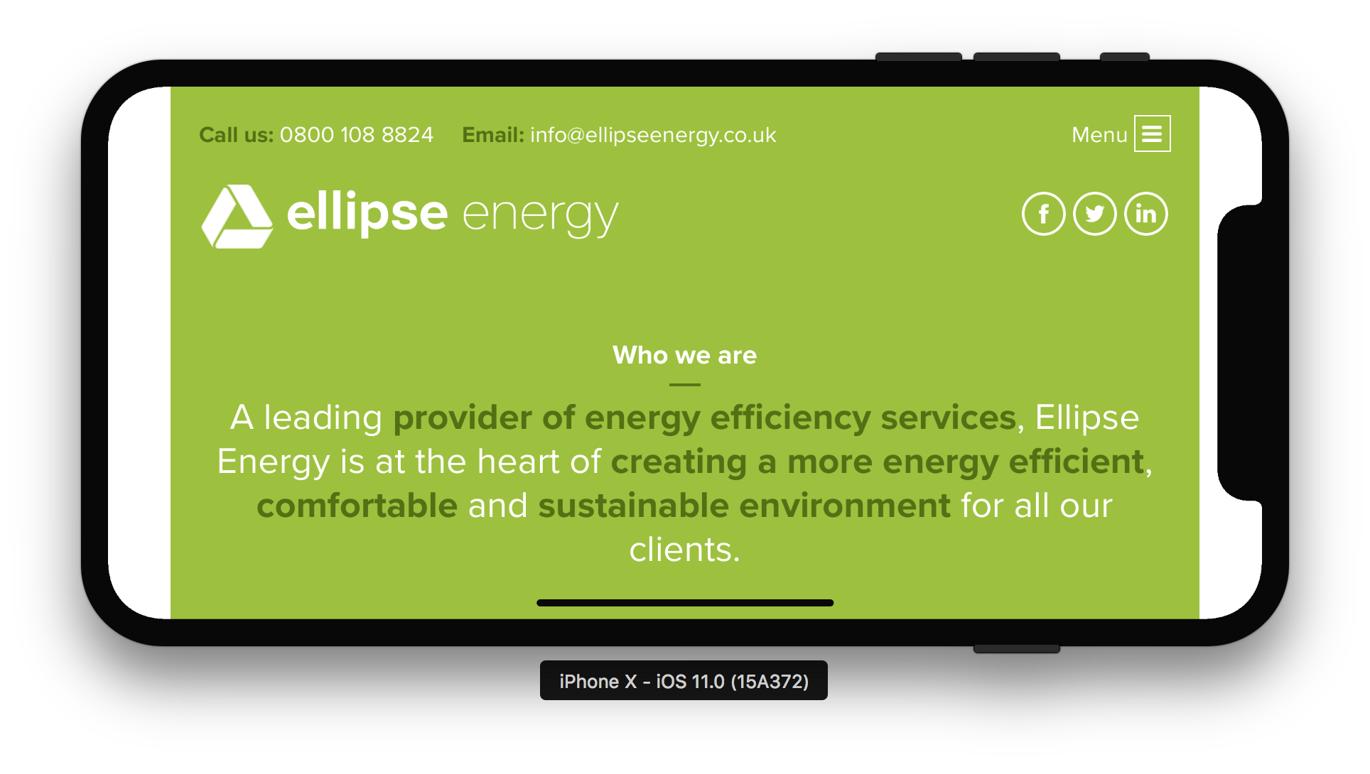
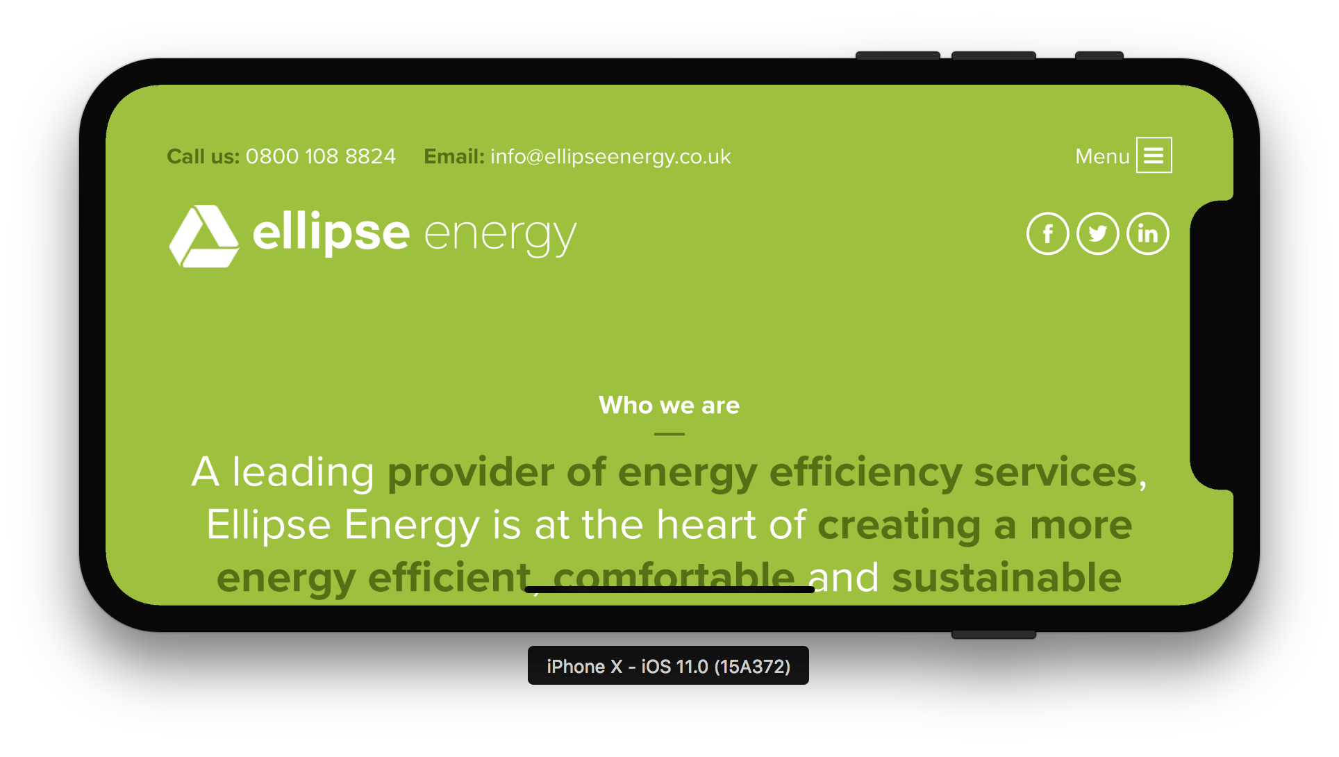
If your website uses a single solid colour for its background then the best and easiest solution for you is to set a background-color property on your body tag. That results in the following on the above website.
As you can see the margins are left intact but are now filled with the correct colour.
viewport-fit
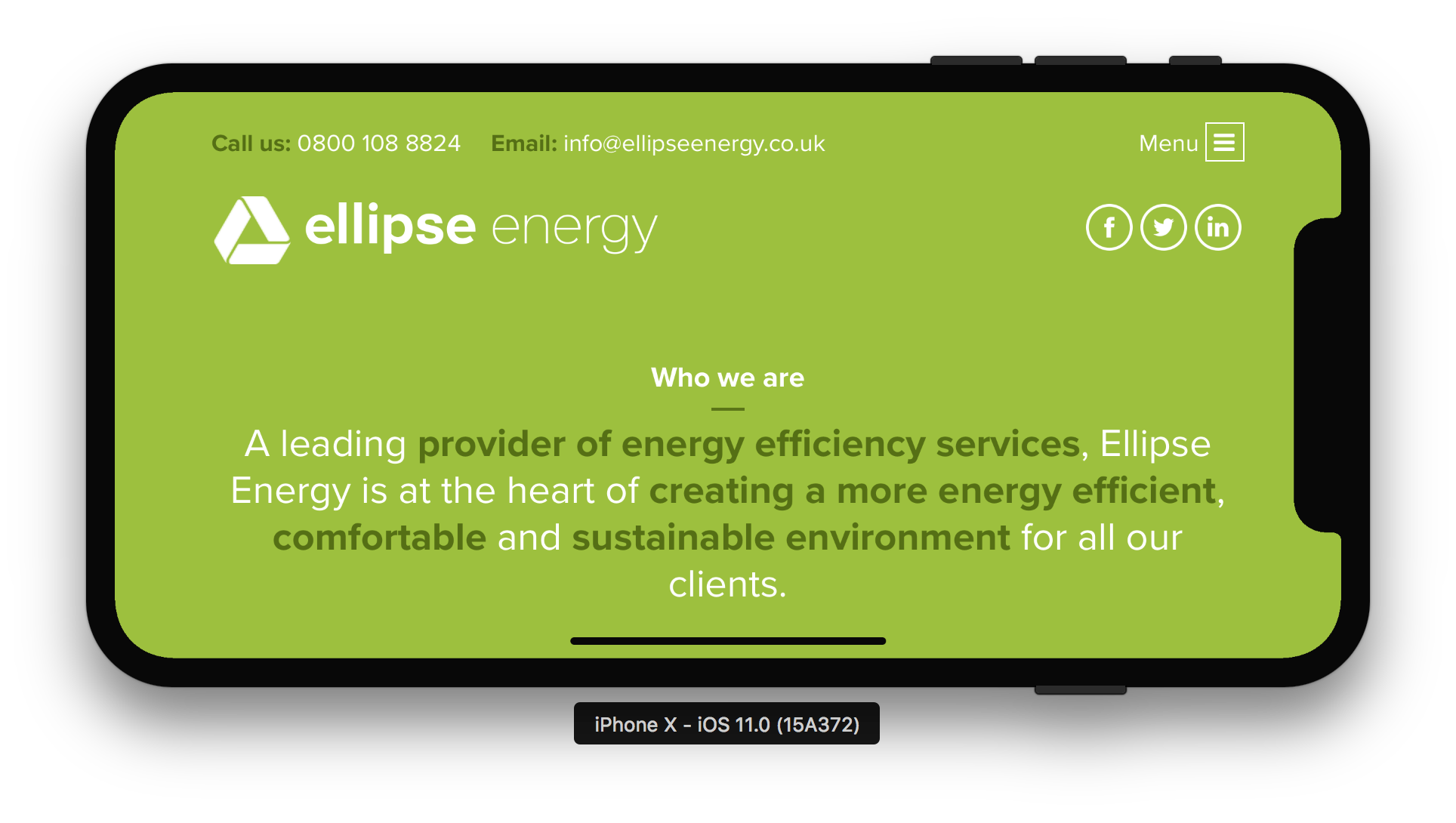
If you prefer to have extra control over your design or you're using a gradient or image as the background then setting a background-color might not be viable. In the latest version of iOS Apple have added the viewport-fit descriptor from the CSS Round Display Spec.
Simply adding viewport-fit=cover to your viewport meta tag will expand your site to fill the entire screen and not just the safe area.
<meta name="viewport" content="width=device-width, initial-scale=1.0, viewport-fit=cover">
That results in the website rendering like this:
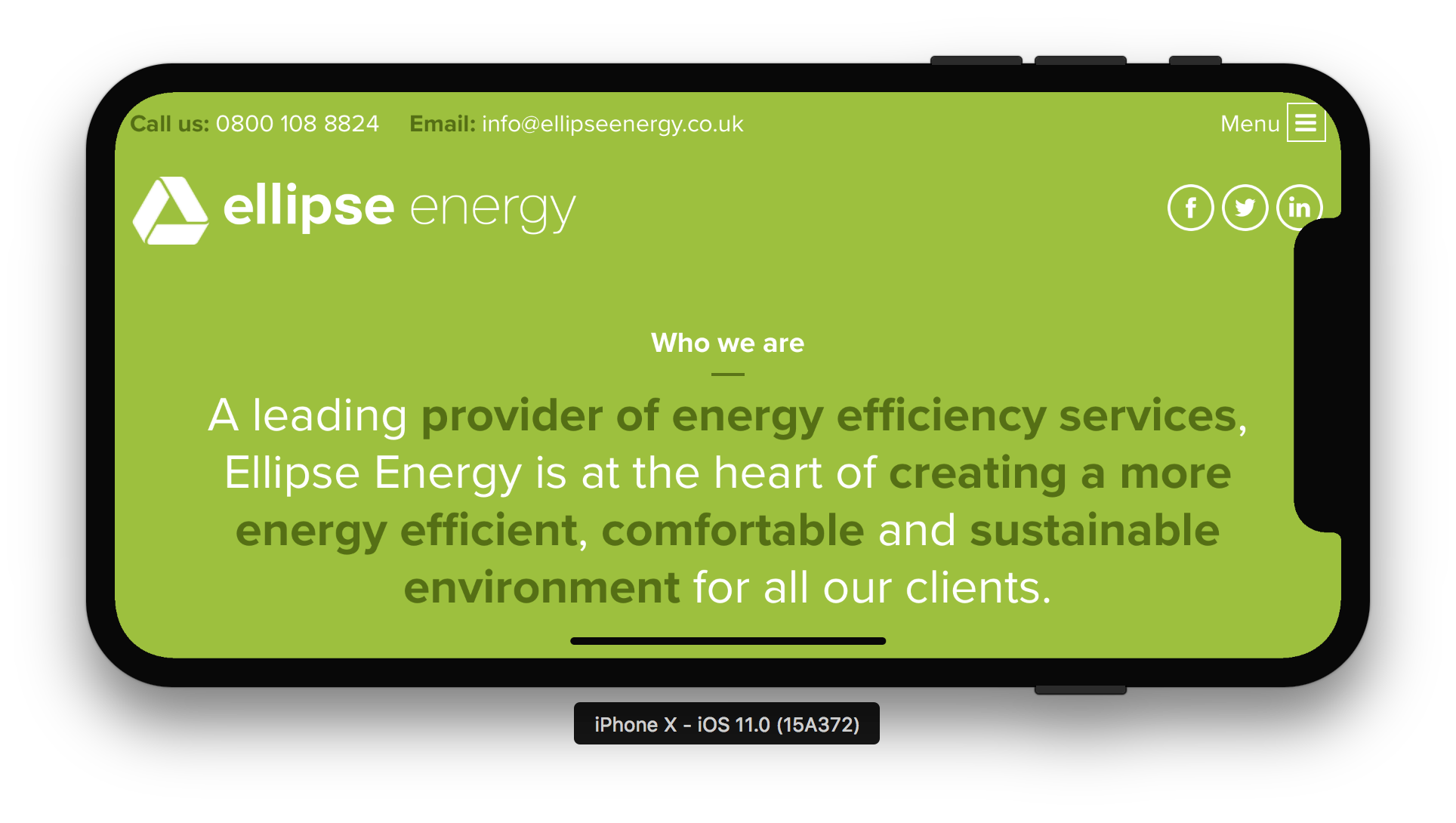
Obviously the design will now need some manual adjustment to accommodate the notch but how that is handled is now down to the developer/designer.
safe-area-inset-*
In order to handle any adjustment that may be required iOS 11's version of Safari includes some constants that can be used when viewport-fit=cover is being used.
safe-area-inset-topsafe-area-inset-rightsafe-area-inset-leftsafe-area-inset-bottom
This can be added to margin, padding, or absolute position values such a top or left.
I added the following to the main container on the website.
padding: env(safe-area-inset-top) env(safe-area-inset-right) env(safe-area-inset-bottom) env(safe-area-inset-left);
This resolved the issue I had with the menu and social media icons perfectly.
UPDATE: Example was changed to use the correct constants on all sides and to reference the correct CSS spec for viewport-fit.
UPDATE 2: constant has been removed from iOS 11.2 in favour of the standardised env. The post has been updated to reflect this.